Inflation Revisited and China Macro Charts


“Our analysis leads us to believe that recovery is only sound if it does come from itself. For any revival which is merely due to artificial stimulus leaves part of the work of depression undone and adds, to an undigested remnant of maladjustments, new maladjustments of its own.” — Joseph Schumpeter (1883 — 1950)


A quotation filled piece today as we first revisit the discussion on the near-term prospects for a spike inflation. Followed by a few charts and discussion on China’s macroeconomic context.


In March, we argued it was premature to worry about inflation:


“For as long as demand, specifically consumer demand, remains capped by the drastic measures being taken to “flatten the curve” and we do not reach a stage where demand far outstrips supply, we consider any discussion over fears of a sudden spike in inflation to be premature.”


Then a few weeks ago discussing the six to twelve month prospects for gold, we wrote:


“When liquidity creation and destruction is led by the private sector it is generally in response to rising or diminishing prospects for economic activity. Whereas government led liquidity creation and destruction usually occurs when market transmission mechanisms are failing or being corrupted.

Diminishing economic prospects typically lead to an increased demand for savings (falling velocity) while rising economic activity typically causes velocity to rise.”


This week the Financial Times reported (emphasis added):


“Bank deposits are surging across Europe as people respond to the economic and social upheaval of the coronavirus pandemic by saving more, fuelling fears among economists that consumers will not come to the rescue of the continent’s shrinking economy.


Savings rates in four of Europe’s five largest economies rose sharply to well above long-run averages in March, according to recently published data from the European Central Bank and the Bank of England.

French savers put aside nearly €20bn in March, well above the long-run average monthly change in bank deposits of €3.8bn. Separate figures from the Banque de France show that by mid-May, the total had risen to more than €60bn since the country’s lockdown began — indicating that the growth of savings accelerated as the crisis deepened.

Italian savers put aside €16.8bn in March, the ECB data show, compared with a long-run monthly average of €3.4bn, while Spanish households saved €10.1bn, up from an average of €2.3bn. UK household bank deposits jumped by £13.1bn in March, a record monthly rise, according to the BoE.”


From A History of Interest Rates by Sidney Holmer (1864 — 1953) and Richard Sylla:


“During 1870-1910, the decades of dynamic expansion, German government bond yields were actually declining. German yields did not decline as far as did British, Dutch, and French yields but were low enough to suggest that the savings of the people were keeping up with the financing requirements of a fast-growing economy. Germany was enjoying the benefits of that mighty weapon, a smooth annual accrual of new savings seeking investment in interest bearing securities. In the years before 1914, German bond yields were similar to yields in the United States, another large and fast-growing nation during the period 1870-1914.”


As long as savings continue to rise, inflation, and by extension bond yields, will remain in check. As we emphasised last week, the developed market bond bull market is far from over.

At the risk of belabouring the point, we turn to the US, where, even as corporations have drawn down credit facilities, banks’ loan-to-deposit ratios hit the lowest level since the 1970’s. Deposit inflows from the Fed’s security purchases as part of quantitative easing measures have more than buffeted demand for credit.

That is, only a fraction of the ‘liquidity’ being created by the Fed through asset purchases is making its way into the real economy.

1-29


China’s Macroeconomic Context


According Co-CEO Patrizio Bertelli, Prada SpA’s sales in China rose “significantly” more than 10 per cent in May. The haves continue to prosper even as the suffering of the have nots knows no respite. This is a global, not a geographic, phenomenon.

On to the discussion on China.

2-29
The above chart compares the annual absolute change in Chinese foreign reserves to the annual rate of change in the producer price index for iron and steel.

To state the obvious, the commodity super cycle between 2001 and 2012 was driven by the infrastructure boom in China. A recovery in commodity prices is not going to manifest on its own and, given advances in technology, supply side reform is probably not going to be enough — something that OPEC can attest to.

The world broadly, and the commodity complex specifically, needs a new source of demand — there are only so many roads to nowhere Beijing will be willing to fund to bailout the rest of world, especially as the rest of the world is becoming increasingly hostile towards China.

3-29

In the chart above, the annual changes in the value of Chinese exports and imports is plotted against each other. The chart visualises how tightly the Chinese leadership manages the flow of capital into and out of the economy.

Imports, the outflow of US dollars, are financed, as it appears, almost exclusively through the inflow of US dollars from exports. With the rise of trade protectionism and introduction of import tariffs, Chinese export growth is expected to dwindle. This is not just bad news for China but also for the rest of the world. Any economy — Australia, Brazil, Germany, etc. — structured around exporting to the Mainland will inevitably suffer from a reduction in demand for goods and services emanating from China.


“For every country, the current account and the capital account must balance to zero. To put it another, every dollar that enters a country, either in payment for that country’s exports, in the form of royalty or services receipts, on the form of foreign investment in domestic assets, must leave that country, either in payment for imports, in the form of royalty or services expenditures, or in the form of outward investment.


Why? Because if an economic entity in any country other than the United States is in possession of an American dollar, earned either by selling an asset to an American or exporting goods to an American, either it will use that dollar to purchases something from abroad or to make a foreign payment, or it will save the dollar by purchasing a U.S. asset.” — The Great Rebalancing, Michael Pettis


In value terms, Chinese exports far exceed Chinese imports. By tying together import and export growth, the Chinese leadership, much like other Asian export-oriented economies, has instituted a policy that forces the accumulation of savings which are then funnelled into foreign assets.

With rising protectionism and the COVID-19 pandemic accelerating the trend away from globalisation, this Chinese policy prescription is now stale. Is the Chinese leadership willing to take the short-term pain necessary to pivot towards the Chinese consumer? The answer hitherto has been a resounding no.

4-29

Financial repression taxes savers and subsidises borrowers. Chinese consumers are the savers and the state-owned enterprises (SOEs) and local governments the borrowers.

Until and unless the Chinese leadership stops penalising savers for the benefit of SOEs, any claims of rebalancing the economy towards the consumer is little more than lip service.


This post should not be considered as investment advice or a recommendation to purchase any particular security, strategy or investment product. References to specific securities and issuers are not intended to be, and should not be interpreted as, recommendations to purchase or sell such securities. Information contained herein has been obtained from sources believed to be reliable, but not guaranteed.

Thoughts and Investment Ideas for 2020

Contents

Thoughts and Investment Ideas for 2020

Ideas

Summary

Energy

The Speculative Phase: Software Over Semiconductors

Playing the Strength in US Housing Demand

Founder Exodus: A Reduction in Existential Flexibility

USD

Thoughts

Summary

Macro Risks

Inflation is the Enemy

Valuations

US Treasury Yield Curve

Modern Monetary Theory

Books

Five We Have Read and Recommend

Five from Our 2020 Reading List


Thoughts and Investment Ideas for 2020


“Can you ask a new question? It’s the new questions that produce huge advances…”

 ― Why Model? by Joshua M. Epstein


“A reward-sensitive person is highly motivated to seek rewards―from a promotion to a lottery jackpot to an enjoyable evening out with friends. Reward sensitivity motivates us to pursue goals like sex and money, social status and influence. It prompts us to climb ladders and reach for faraway branches in order to gather life’s choicest fruits.


But sometimes we’re too sensitive to rewards. Reward sensitivity on overdrive gets people into all kinds of trouble. We can get so excited by the prospect of juicy prizes, like winning big in the stock market, that we take on outsized risks and ignore obvious warning signals.”

 ― Quiet: The Power of Introverts in a World That Can’t Stop Talking by Susan Cain


“Stock prices have reached what looks like a permanently high plateau.”

 ― Irving Fisher (1867 – 1947)


The last twelve months, and pretty much the entirety of the last decade, handsomely remunerated the reward-sensitive ― the risk-takers, the optimists, the dip-buyers, the trend-followers, the bitcoin HODLers ― and punished the sceptics, the value-conscious, the doomers and the gloomers, and the short-sellers, without prejudice.


The sceptics, and others of their ilk, are quick to remind of the cyclicality of markets even as they lick their bull-horned wounds. That, as surely as night follows day, the years of plenty will be followed by years of famine. That valuations matter.


They, the doubters, are, as history shows, not wrong. Markets are indeed cyclical. Valuations do matter, eventually. The record shows, claiming otherwise will surely find you embarrassed, if not immediately, most definitely in due course.


There is, however, a wrinkle in the cyclicality argument.


All finite, deterministic systems are guaranteed to cycle. Capital markets, however, are neither finite nor deterministic.


Finite systems, to paraphrase James P. Carse author of Finite and Infinite Games, are comprised of known participants, fixed rules and agreed upon objectives. Infinite systems or games, on the other hand, are defined by participants both known and unknown, changing rules and an objective to keep the system or game perpetuating.


Markets are an infinite system and market participants ― investors, traders, brokers, market makers, regulators, corporations and whoever else that may choose to participate ― are engaged in an infinite game.  To survive in an infinite game, participants must adapt or die. It is this process of adaptation that allows the system to perpetuate but at the same time necessitates that neither the duration nor the form of any given market cycle can be known before the fact. Just because the average bull market may have lasted 7-years or ended within a certain time period following a yield curve inversion does not in any way imply that this or the next market cycle will follow the same pattern.


Market participants should not, nay cannot, simply rely on a passing understanding of market cycles. Rather, we must all continuously strive to better understand how the game and the participants are adapting so that we may have a better shot at positioning for that which lies ahead.


In this piece, we try to ask questions ― with a bit of luck, some different, if not entirely new, ones ― and share our thoughts and ideas that, we hope, will help you, the reader, better play the infinite game over the coming six to twelve months.


Note: Comparable pieces for 2018 and 2019 can be found here and here, respectively.


Ideas

Summary


  • Energy: Long Chevron $CVX, National Oilwell Varco $NOV and Cactus Inc $WHD and avoid allocations to energy importing emerging markets


  • Speculative Phase: Prefer software $IGV to semiconductors $SOXX in the US


  • Founder Exodus: Avoid long positions in companies that have recently seen their founders exit such as Alphabet $GOOG, Under Armour $UAA, Chipotle $CMG and Alibaba $BABA


  • USD: Below 95 on the US Dollar Index $DXY, short Australian dollar and New Zealand dollar


Energy


“Rise early, work hard, strike oil.” ― John Paul Getty


“Do not waste energy, make it useful.” ― Wilhelm Ostwald (1853 – 1932), winner of the Nobel Prize in Chemistry in 1909


Humans have been burning fossil fuels to generate electricity since 1882. Coincidentally, the first hydroelectric power plant also began operations in 1882. Fissioning uranium isotopes has been a source of electricity since 1956.


The technology to harness fossil fuels as a source of energy at scale has transformed everything from agriculture to industry, transportation to warfare, quality of life to the environment, and everything in-between. Fossil fuels remain the most concentrated and versatile source of energy that can be converted at affordable cost and high rates of efficiency into heat, light and motion.


The quest to harness alternative sources of energy at comparable levels of efficiency, cost and scale as to that of fossil fuels remains just that, a quest. Progress is being made and the political will to turn our collective backs on fossil fuels has never appeared stronger.


The rise of environmental, social and governance (ESG) criteria in investing, the US Democrats’ “Green New Deal” on climate mitigation, and the recent unveiling of the “European Green Deal”, are raising the cost of capital for the global energy sector. All the while, returns on invested capital being generated by the sector remain dismal.


The potential unintended consequence of a seemingly coordinated desire to penalise the global energy complex and starve it of fresh capital is the prospect of a negative energy supply shock becoming increasingly probable.


With the promises of blockbuster shale wells fracking companies made to investors turning out to be a busted flush ― according to The Wall Street Journal wells drilled recently in the four largest US oil regions were on track to produce nearly 10 per cent less oil and gas over their lifetimes than companies forecast ― and the sector facing ever increasing costs of capital, the prospects of a global energy supply shock in the near-to-medium term, we think, are under-priced.


Barring a negative-demand shock, or a breakthrough in technology that enables the harnessing of alternative sources of energy as efficiently and cost effectively as harnessing fossil fuels, we think oil prices can head higher, much higher, in the near- to medium-term.


We often use the 48-month moving average, for commodities and major currency crosses, to guide our trading strategy. For now, WTI crude prices remain above the moving average. As long as prices do not meaningfully breach the 48-month moving average, our bias is to be long in expectation of prices continuing to climb the ‘Wall of Worry’ over the next 6 to 12 months.


1


Tactical Perspective


President Trump’s decision to order the Iranian Major General Qasem Soleimani’s death via drone attack in Baghdad in the evening on 2 January saw oil prices spike by as much as 4 per cent. Such is the antipathy towards energy stocks that despite a sharply higher oil price, the SPDR Energy Select Sector ETF $XLE closed in the red on 3 January.


With that being said, oil may have to work off overbought conditions if and when the geopolitical risk premium subsides. We would hold off till that point to have a full-sized allocation to energy.


Ideas: Long Chevron Corporation $CVX, Long National Oilwell Varco Inc. $NOV, Long Cactus Inc. $WHD.


Avoid: Energy importing emerging markets.


The Speculative Phase: Software Over Semiconductors


If the US equity market is in the throes of a market melt-up, or an almighty blow-off, the rally should devolve into becoming increasingly speculative.


Last year, software stocks were leading the pack till around mid-year when, as the trade tensions between the US and China thawed, semiconductor stocks started climbing a wall of worry and ended the year at all-time highs. Software stocks were the laggards during the second-half of last year.


We think as the rubber of hope meets the road of financial performance semiconductors are likely to falter. Further, given the sensitivity of semiconductor stocks to the trade deal and with a phase one deal between the US and China more than priced in, it behoves the prudent investor to pare allocations to semiconductor stocks. Rather, as growth becomes precious once again, we think, investors are likely to turn to software afresh. And as software incumbents look for new ideas and business models, more than a few acquisitions are likely to be in the offing.


For now, in US equities, we prefer software to semiconductors.


Ideas: Long Manhattan Associates $MANH, Long Salesforce.com $CRM, Long Avalara $AVLR, Long Slack Technologies $WORK, Long iShares Expanded Tech-Software Sector ETF $IGV


Avoid: iShares PHLX Semiconductor ETF $SOXX


Playing the Strength in US Housing Demand


Falling long-term interest rates equate to more affordable housing and on a relative basis make the economics of owning a home better than of renting one. With US long rates having dropped sharply during the summer, US home purchases have picked up.


On an annual basis, sales in October increased 4.6 per month from the same month the previous year, marking the fourth straight month of year-over-year gains.


With homeowners in the US remaining in their homes thirteen years on average, five years longer than they did in 2010, and housing inventory estimated to be at an 11-year low, the surge in demand for housing is rippling through to increased applications for and issuance of building permits.


The thing about buying a home is that, once you have bought one, it comes a with a long list of mandatory and not-so-mandatory purchases. For this reason, US consumer durable goods spending tends to closely track home sales and housing permit issuance with a lag.


2


While demand for housing fluctuates with long-term interest rates, once a house has been bought the spending that follows it, will follow irrespective of the fluctuation in interest rates. This makes consumer durable plays, broadly the consumer discretionary sector, a less interest-rate sensitive means of gaining exposure to the robust demand for US housing.


Ideas: Long Floor and Décor $FND and conditional on high-levels of risk appetite small caps such as Bassett Furniture $BSET and Hooker Furniture $HOFT


Founder Exodus: A Reduction in Existential Flexibility


Simon Sinek in a talk about his book The Infinite Game shares an anecdote in which Steve Jobs was almost on a whim willing to pivot Apple Inc., despite the prospect of huge near-term losses, when faced with an existential crisis. He describes this ability to be “existential flexibility”.


Founders, in general, are more likely to have the strength of character and conviction to make the difficult decisions ― that is, existential flexibility ― than do managers. A number of prominent companies ― such as Google, Under Armour, Alibaba and Chipotle Mexican Grill to name a few ― have recently seen their founders step down.


With the business cycle long in the tooth and regulatory risks, particularly for technology companies, rising, we prefer to avoid investing in companies that have transitioned from founder CEOs to manager CEOs.


USD


Analysts, ourselves included, have spent an inordinate amount of time and energy in an attempt to ascertain the direction of an asset that has remained in a mind-numbingly narrow range. Such is the importance of the greenback, implicit or explicit, in any investment framework, however, that we would be remiss to not once again touch upon it.


Yield Differentials


We use Australia and New Zealand, given access to a longer history and better quality of data, and because they serve as good proxies for China and commodity producing emerging markets. The below charts show that on the 10-year government bond yield differential basis there is a strong case to be made for a stronger dollar relative to these currencies. (We also include Indonesia, despite the limited data, as a further example.)

3


4


5a.png


From the Perspective of Select ‘Fragile’ Emerging Markets


The real trade-weighted dollar has posted a smaller advance since mid-2014 than the US Dollar Index $DXY, suggesting that the threat to the world from a stronger US dollar is not as great as is often hyped to be.


Below we share three charts of select emerging markets that suffered severe crises and saw their currencies plummet versus the US dollar in the 1990’s. Most of these countries are better placed to withstand a stronger US dollar than they were prior to the crises in the 1990’s and at the time of the ‘taper tantrum’ in 2013.

6

7

8

Note: Pre-crisis metrics for 1996 for all countries except India, for India we use 1990


While a stronger US dollar would be painful, it would not, we think be apocalyptic barring a a severe spike (10%+ in a matter of months).


Ideas: Using $DXY as the guidepost, long US dollar below 95 versus the Australian dollar and New Zealand dollar, given the low cost of carry.


Thoughts


Summary


  • Macro Risks: Using rallies to reduce equity exposures tactically and increase bond allocations, take profits in European equities


  • Inflation is the Enemy: Growth shocks and not inflation shocks are probably the bigger risk to diversified portfolios in the near-term


  • Valuations: Gold is indicating equity market multiples have peaked


  • US Yield Curve: Prefer steepeners and then the short-end of the curve


  • Modern Monetary Theory: Probably not what you expect


Macro Risks

9

The chart above is of the 52-week moving average of the Citi Macro Risk Index. It is not the magnitude rather the direction of the risk index that acts as a cyclical indicator.  (Rising line indicates increasing macro risks.)


With the risks that built up during the sell-off in the last quarter of 2018 and the recession fears that peaked in the summer of last year having been largely unwound, some caution is now warranted. We think equity rallies hereon should be used to gradually reduce allocations to leave powder dry for cyclically more opportune times to go on the offensive.


10


The chart above is the ratio of gold, in euros, to the Euro Area all shares index versus the differential between 10-year government bond yields of the ‘fragile’ European economies and Germany. (For the latter we use the average of the yields on Spanish, Portuguese and Italian 10-year bonds and subtract from it the yield on 10-year German bonds.)


The two series are a means of measuring sovereign, or break up, risk in Europe. Rising ratios imply rising sovereign risks and a rush towards the safe havens of gold and German debt. Recently, with gold having rallied and some form of Brexit related agreement forming, the two time-series have diverged. The yield differentials indicate a declining risk premium while the gold-to-shares ratio indicates a rising risk premium.


With the hard work to resolve Brexit still pending and the potential for a flare up in a trade spat with President Trump under-priced, we think there is more than a modicum of complacency on investors’ part with respect to risks in Europe. Profits should be taken on European equities.


Avoid: Shorting funding currencies, namely the euro, Swiss franc and Japanese yen, as they can rally sharply during risk-off periods


Inflation is the Enemy


Generally, the main macroeconomic risk factors that drive expected returns in equities and bonds are growth and inflation. With equity returns being most sensitive to growth and bonds to inflation.


Lower expected risk-adjusted returns in equities begin to be priced in when the economy is supply constrained and central banks are tightening monetary policy to lower nominal growth. This also tends to be the more inflationary phase of the business cycle with rising unit labour costs and valuation multiples at or near cycle highs. In contrast, higher expected returns begin to be priced in when the economy is operating below potential and central banks are easing monetary policy to prop-up nominal growth. This generally tends to be a disinflationary phase in the business cycle with unit labour costs falling and valuation multiples at or near cycle lows.


11


The chart above is of the trailing earnings yield (inverted price-to-earnings ratio) of US stocks and realised inflation rates. Theoretically, since stocks are real assets, changes in the rate of inflation should not have a meaningful impact on stock prices or valuation multiples. In practice, however, the principle does not hold. Historically, US earnings yields have been more closely related to the rate of inflation than to nominal or real bond yields.


A comparable relationship between inflation and earnings yields has also been found to exist in many other markets.


The expected risk-adjusted return in bonds also tends to be counter-cyclical. Specifically, policymakers are more prone to hiking policy rates when there is little to no slack in the economy and inflation pressures begin to emerge.


At a portfolio level, risk-adjusted returns of the portfolio also depend on the correlation of constituent assets over the course of the cycle. Economic theory has it that asset prices reflect the present value of future cash flows. Given that inflation determines the discount rate for both equities and bonds, it also tends to drive both assets in the same direction. At times when inflation shocks dominate, equities and bonds become positively correlated. While, since growth rates affect equities more than they do bonds, growth shocks dominating leads to bonds and equities being negatively correlated.


12


The chart above is of the US stocks-to-bond correlation and the 6-month rolling average of the annual rate of inflation, as measured by the consumer price index excluding shelter.


During the period from 1965 through to 1997, when inflation expectations experienced large swings, the stock-to-bond correlation was almost consistently positive. That is, changes in inflation expectations drove both stock and bond returns and during periods of equity market weakness bond allocations did not make up the difference. For example, in the sub-period between 1973 and 1981, during which there was a negative supply shock from the OPEC oil export embargo, multiple recessions, high unemployment rates and high inflation, equity market weakness coincided with poor bond market performance.


The time-series demonstrates how the correlation between equities and bonds is not static. The implication being that bond allocations do not always serve as a suitable diversifier for equity allocations. Rather, it is the prevailing market regime, as described above, that determines the efficacy of bond allocations to lower drawdowns and portfolio level volatility during equity market sell-offs.


As the chart shows, the last decade, as all of us already know, was characterised by low-growth, negative growth surprises and low-and-steady inflation. That is, a decade of negative correlation between bonds equities.


Asset Allocation


A strategic asset allocation framework, it then follows, should contain equity and bond exposure levels conditioned on the phases of the business cycle.


Upside inflationary shocks make traditional 60/40 and risk-parity like allocations suffer as bonds and equities sell-off concomitantly.  While periods of benign inflation with the occasional growth shock are well-suited to portfolios diversifying equity exposures with heavy bond allocations.


According to our framework, however, the probability of a near-term inflationary shock remains low. Rather, we anticipate the risk of a near-term negative growth shock to be much higher than that of inflation sustainably surprising to the upside.


“The driving force for underlying profits is credit growth, and in the process the most conservative among institutions compromise standards and engage in practices that they would not have dared pursue a decade or two ago. The heroes of credit markets without a guardian are the daring―those who are ready and willing to exploit financial leverage, risk the loss of credit standing, and revel in the present casino-like atmosphere of the markets.”

Interest Rates, the Markets and the New Financial World (1986) by Henry Kaufman


13


An example of growth remaining elusive comes from the Federal Reserve’s recent senior loan officer survey, which revealed that banks left commercial and industrial lending standards mostly unchanged amid weakening demand for credit.


Bonds, rather than commodities and other inflation hedges, remain, for the near-term, the most suitable hedge for equity allocations.


Ideas: Long Japanese Government Bonds and allocations overweight bonds relative to equities and commodities (excluding gold / precious metals)


Avoid: Treasury Inflation Protected Securities (TIPS)


Valuations


14


The chart above is of the S&P 500 Index expressed in terms of gold (in US dollars per Troy Ounce) versus the index’s cyclically adjusted price-to-earnings ratio (as calculated by Professor Robert Shiller).


While we use the CAPE to smooth out the effect of the Global Financial Crisis, using annual price-to-earnings multiples would convey the same message. In simple terms, the price of gold is inversely correlated to the price-to-earnings multiple of the index.


The price of the S&P 500 in terms of gold suggests that valuation multiples have peaked on a cyclical basis.


Ideas: Gold can serve as a hedge for equity market multiple-contraction


US Treasury Yield Curve


“During 1870-1910, the decades of dynamic expansion, German government bond yields were actually declining. German yields did not decline as far as did British, Dutch, and French yields but were low enough to suggest that the savings of the people were keeping up with the financing requirements of a fast-growing economy. Germany was enjoying the benefits of that mighty weapon, a smooth annual accrual of new savings seeking investment in interest bearing securities. In the years before 1914, German bond yields were similar to yields in the United States, another large and fast-growing nation during the period 1870-1914.”

A History of Interest Rates by Sidney Homer (1864 – 1953) and Richard Sylla


The chart below is of the US yield curve (10 year minus 3 month) versus private saving less private investment. The latter points towards a further steepening of the US yield curve.

15


The chart below is of the de-trended 3-month Treasury bill rate (inverted) ― de-trended by subtracting the 10-year moving average from the bill rate ― versus the US Treasury 10-year and 3-month yield curve. The chart dates from 1962 till today, suggesting that the de-trended 3-month Treasury bill rate contains information about the direction of the yield curve.


16


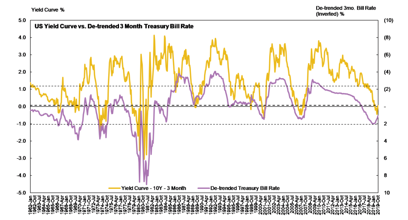
The two-time series have a correlation of -0.75 with an r-squared of 57 per cent.


(The dashed lines on the above chart are the average de-trended bill rate and levels one standard deviation above and below the average.)


The relation between the de-trended bill rate and the yield curve indicates a strong tendency of interest rates to mean revert. The wider the gap between the current de-trended bill rate and its long-term average, the stronger the markets expectation of mean-reversion.


This relationship, too, points towards a further steepening of the US yield curve.


Ideas: Long yield curve steepeners or alternatively long the short-end of the yield curve

Modern Monetary Theory


‘War Board’ Proposed


April 13, 1933


A plan to mobilize private industry under the government for expansion in the production of articles and materials in normal demand, this expansion to be coeval with the administration’s public works activities, is being developed by the President’s closest advisors and they hope to persuade him to attempt it.


Certain types of industry, under the plan, would be assembled and regulated by a government agency reminiscent of the War Industries Board. Competition would be regulated: hours of work and minimum rates of pay would be fixed; and some of the proponents of the idea also would have the government guarantee manufacturers against loss in resuming or increasing the manufacture of prescribed articles and materials.


The thought behind the plan is that a public works program standing by itself, even if the five billions is expended upon it, will not sufficiently reduce unemployment or make use of the new purchasing power. It is contended that private industry must, at the same time, be put in a position to absorb the new purchasing power, composed of the billions which the government will be putting in the hands of citizens all over the United States. To do this, it must resume manufacture, and that will restore many to private employment in the factories themselves and in the retail establishments which will dispose of the products of these factories. This will, in turn, give purchasing power to those privately as well as those governmentally employed. A part of the billions will then flow back to the Treasury in various forms of taxation.


The argument which seems to have been most effective in bringing the administration to support the public works appropriations is that the deflationary policy has cut down the purchasing ability of the country by seven billions. Of this five billions is in closed banks, one billion in the budget savings and another billion in reductions made by the several State governments.


The vast public works program having been definitely agreed upon, with the probability that it may involve an expenditure of as much as five billions, it soon became evident to the architects of administration policy that this plan needed a companion.


It was all very well to balance the budget, and, with government credit thus establish, to borrow billions for roads, buildings, flood control and the like. But this question remained: How could private industry get the full use of those billions for purchase? Without some form of government stimulation and aid, it was felt that manufacturers of ordinary consumers’ commodities would wait to clear their stocks, while retailers were clearing theirs, and when the manufacturers did resume production, they would simply proceed at “depression pace.”


The result of these considerations was the plan to set up a government agency to induce industrial expansion, to quicken and regulate it meanwhile, to protect it against loss and perhaps even to fix the prices of labor’s product as well as the wage of labor itself.”

In The Nation: 1932-1966, Arthur Krock (1886 – 1974)


Modern Monetary Theory (MMT) advocates fiscal measures and the role of government in the creation of money over monetary policy and as such stands in almost complete contrast to traditional macroeconomic theory. A key to understanding MMT is to appreciate the difference between users of currency, primarily the private sector, and the monopoly issuer of said currency, the government.


Beginning with the economic assumptions of full employment and full capacity utilisation ― that is, a country facing real resource constraints. Under such a scenario, inflationary pressures can become a genuine and immediate danger and monetary policy can, arguably, play a critical role play to dampen excess demand and by extension inflationary pressures. For instance, by raising the level of interest paid on excess reserves, the central bank could increase the opportunity cost of lending activities, encouraging banks to instead place more cash with the central bank or demand a higher rate of return from potential borrowers. Thereby raising the cost of capital.


Proponents of MMT contend that adjustments to the government’s fiscal policy could just as easily be used to achieve the same objective. For example, excess demand could be dampened by raising tax rates, be it income, sales or value-added taxes.


The reality today, however, is that few, if any, economies face resource constraints. Rather, interest rates persist at or near historic lows, inflationary pressures have remained transitory at best and the global commodity complex remains largely mired by excess capacity. Monetary policy has proven impotent in reflating the economy and zero-bound interest rates have neither spurred demand for credit nor compelled banks to lend.


In the current state of the global economy, MMTers argue, is when the prescriptions of the theory are most potent. Tax cuts, for example, can be utilised to immediately increase private sector disposable incomes.


By divvying up the economy across private and public sectors and recognising that the balance sheet constraints across the two sectors are incongruent, MMT perceives fiscal policy as a means to lessen (increase) private sector funding pressures, when the economy is operating below (at or above) capacity.


In a fiat currency system, the government has the flexibility to affect changes in private sector behaviour by fine-tuning its budget deficit. At a time when the private sector is deleveraging, if government fails to offset this by widening its budget deficit, it effectively starves private sector activity. In a fiat currency system, it is government, not the central bank, that creates new liabilities that become the assets of the private sector.


So, at any level of income, if the private sector decides to deleverage, the public sector must by definition, end up saving less by running a larger budget deficit or shrinking a budget surplus. In an ideal world, any shifts in the private sector’s propensity to save would be matched by an immediate change in the tax rate, and the combined income of the public and private sectors would remain stable. A key policy prescription stemming from MMT, then, is to keep monetary policy steady and to manage the economy by adjusting the tax rate.


The Practical Implications


Most discussions on MMT devolve into either how it spells the end of the US dollar, or fiat currencies in general, or how it will spur uncontrollable inflation and therefore one must own gold or bitcoin or both. With time these proclamations may prove correct. The thing about capital markets, however, is that for the most part it is the path not the endgame that matters.


And as far as the path is concerned, it is not unreasonable, in our opinion, that, initially, MMT, or any other form of government led fiscal activism, reinforces deflationary not inflationary forces. That is, by opening up the fiscal spigot policymakers continue to keep cost of capital artificially suppressed thereby further delaying the inevitable impairment of excess capacities, zombie companies and unproductive debts.  Ever increasing advantages would then continue to accrue to large companies, with access to low cost capital, at the expense of small and medium enterprises, further compounding the issues of inequality and declining productivity. Such a deflationary death spiral is what, we think, precipitates the endgame, not a sudden burst of inflation.


Books


Five We Have Read and Recommend


  1. Surfing the Edge of Chaos: The Laws of Nature and the New Laws of Business by Richard Pascale, Mark Milleman and Linda Gioja
  2. The Match King: Ivar Kreuger, The Financial Genius Behind a Century of Wall Street Scandals by Frank Partnoy
  3. The Man Who Solved the Market: How Jim Simons Launched the Quant Revolution by Gregory Zuckerman
  4. The Great Rebalancing: Trade, Conflict, and the Perilous Road Ahead for the World Economy by Michael Pettis
  5. How Global Currencies Work: Past, Present, and the Future by Barry Eichengreen, Arnaud Mehl, and Livia Chitu


Five from Our 2020 Reading List


  1. The Education of a Speculator by Victor Niederhoffer
  2. The Model Thinker: What You Need to Know to Make Data Work for You by Scott E. Page
  3. Micromotives and Macrobehavior by Thomas C. Schelling
  4. Clash of Empires: Currencies and Power in a Multipolar World by Charles Gave & Louis-Vincent Gave
  5. Energy and Civilization: A History by Vaclav Smil


Thank you for reading and please share!


This document should not be considered as investment advice or a recommendation to purchase any particular security, strategy or investment product. References to specific securities and issuers are not intended to be, and should not be interpreted as, recommendations to purchase or sell such securities. Information contained herein has been obtained from sources believed to be reliable, but not guaranteed.

A Mix of Macro Charts

“The Federal Reserve has an official commitment to two different policies. One is to prevent inflation from getting too high. The second is to maintain high employment… the European Central Bank has only the first. It has no commitment to keep employment up.” ― Noam Chomsky


“A small group of people, they raise the price of oil and the whole world will suffer from this.” ― Ahmed Zaki Yamani, minister in OPEC for 25 years

A Mix of Macro Charts

In this week’s piece we share three macro charts that we hope will provide readers with an insight on how various risks are priced in markets by a seeming disparate range of instruments and indicators.

Short-Term Rates and the Yield Curve

YC 3m bills

The above chart is of the de-trended 3-month Treasury bill rate (inverted) ― de-trended by subtracting the 10-year moving average from the bill rate ― versus the US Treasury 10-year and 3-month yield curve. The chart dates from 1962 till today, suggesting that the de-trended 3-month Treasury bill rate contains information about the direction of the yield curve.

The two-time series have a correlation of -0.77 with an r-squared of 59 per cent.

(The dashed lines on the above chart are the average de-trended bill rate and levels one standard deviation above and below the average.)

The relation between the de-trended bill rate and the yield curve indicates a strong tendency of interest rates to mean revert. The wider the gap between the current de-trended bill rate and its long-term average, the stronger the markets expectation of mean-reversion. For example, the de-trended bill rate being one standard deviation above (below) its average generally serves as a guide post to position for a yield curve steepening (flattening / inversion). (The time series is inverted, so above the average means visually below on the chart.)

The de-trended bill rate recently reached one standard deviation above its long-term average and has since turned down, suggesting that fixed income investors position for a yield curve steepening, as opposed to a direct long or short position at either end of the curve.


Equity market investors can play a steepening yield curve by being long financials.


The Golden Period of Risk-Parity and 60/40 Allocations

stock bond correl

The above chart is the 6-month rolling US stocks-to-bond correlation and the 6-month rolling average of the annual rate of inflation, as measured by the consumer price index.

The relationship demonstrates (1) how the capital markets price in inflation and (2) the correlation between stocks and bonds is not static. The implication of the latter is that bond allocations do not always serve as a suitable diversifier for equity allocations. Rather, it is the prevailing market regime that determines the efficacy of bond allocations to lower draw downs and portfolio level volatility during equity market sell-offs.

Capital markets price in inflation ― outside financial crises when the safe haven demand for bonds can overwhelm implicit inflation expectations ― through an adjustment of the correlation between stocks and bonds. During the period from 1965 through to 1997, when inflation expectations experienced large swings, the stock-to-bond correlation was almost consistently positive. That is, changes in inflation expectations drove both stock and bond returns and during periods of equity market weakness bond allocations did not make up the difference. For example, in the sub-period between 1973 and 1981, during which there was a negative supply shock from the OPEC oil export embargo, multiple recessions, high unemployment rates and high inflation, equity market weakness coincided with a poor bond market performance.

To re-iterate the point again, it is market regime that determines whether Treasury bonds are a “wonderful hedge” or a “terrible investment”. Moreover, we can from the chart above why the last decade and a half has been a golden period for risky parity strategies and 60/40 allocations ― stock-to-bond correlations have been and remained at or close to 100-year lows.

The question then is, how does one determine market regime?

Market regime is just another way of saying inflation expectations. Rising inflation expectations equate to rising stock-to-bond correlations. Retreating inflation expectations translate to declining stock-to-bond correlations. By extension, something touched upon last week, the combination of stable, that is expectations of more of the same, and low-levels of inflation makes for the optimal investment environment.

Continuing to bet on more of the same when stock-to-bond correlations have been at 100-year lows for a prolonged period is surely asking for trouble. All the more, with political movements the world over nudging the global economy from being driven by negative and positive demands shocks to becoming one that will be driven by positive and negative supply shocks, a market regime change seems inevitable.


Demand shocks, either positive or negative, do not move the Phillips curve; supply shocks, however, shift it in and out. When the Phillips curve shifts in response to a negative supply shock, nominal bonds exacerbate losses suffered in equity markets. For example, an adverse supply shock in the form of the oil embargo by the OPEC in 1973 shifted the Phillips curve by increasing both production and distribution costs of almost all industries and led to losses for both equity and bond market investors.


That is why we think investors need to consider instruments other than bonds to hedge equity allocations. The Japanese yen, precious metals, Treasury Inflation-Protected Securities (TIPS), oil and energy stocks are some of the viable options. It is likely that there are others.


Why do we keep insisting on oil and energy stocks? Well because oil is the most obvious negative supply shock we can conceive of in the event of an Elizabeth Warren or Bernie Sanders presidency. Both Democratic presidential contenders have proposed to ban fracking altogether.


Europe Sovereign Risk Model

euro sov risk.png

The above chart is the ratio of gold, in euros, to the Euro Area all shares index versus the differential between 10-year government bond yields of the ‘fragile’ European economies and Germany. (For the latter we use the average of the yields on Spanish, Portuguese and Italian 10-year bonds and subtract from it the yield on 10-year German bonds.)

The two series are a means of measuring sovereign, or break up, risk in Europe. Rising ratios imply rising sovereign risks and a rush towards the safe havens of gold and German debt. Recently, with gold having rallied and some form of Brexit related agreement forming, the two time series have diverged. The yield differentials indicate a declining risk premium while the gold-to-shares ratio indicates a rising risk premium.

We think the two series should start to converge with European stock markets continuing to head higher.

This post should not be considered as investment advice or a recommendation to purchase any particular security, strategy or investment product. References to specific securities and issuers are not intended to be, and should not be interpreted as, recommendations to purchase or sell such securities. Information contained herein has been obtained from sources believed to be reliable, but not guaranteed.

Lighten Up On Semiconductors


“The good times of today, are the sad thoughts of tomorrow.” — Bob Marley


Chinese Economic Data


The Chinese economy grew at 6.4 per cent year-over-year during the first quarter of 2019, matching the economy’s growth during the fourth quarter of last year but below the 6.6 per cent growth achieved for the full year during 2018. Growth came in slightly higher than consensus expectations and appears to have been buoyed by strong credit growth — system-wide financing was up 10.7 per cent year-over during March, led by an acceleration in lending by Chinese financial institutions. Total loans extended by financial institutions increased by 13.7 per cent year-over-year in March to reach its highest rate since June 2016.


CNLNTTLY Index (China Total Loan 2019-04-18 13-38-21.png


There was a sharp recovery in the Chinese industrial sector during March, industrial value added surged to 8.5 per cent year-over-year, up from 5.7 per cent in February. Part of this growth can probably be attributed to the Chinese New Year falling in early February this year versus being in late February last year — factories are likely to have only reached stable production into March in 2018. We will look to April data upon its release for further clarity.


CHVAIOY Index (China Value Added 2019-04-18 13-54-41.png


Despite the above caveat, some of the notable metrics on the industrial side include:


  • Smartphone, automotive and semiconductor production dropped by 7, 3 and 2 per cent, respectively.


The bad news for semiconductors was not limited to production. Chinese imports of diodes and semiconductors during March declined by 11.8 and 12.7 percent year-over-year in value and volume terms, respectively. For the first quarter imports are down 9.6 and 14.7 per cent year-over-year in value and volume terms, respectively.


The decline in semiconductors may prove to be a red herring. It is altogether possible that Chinese authorities are eager to limit semiconductor imports up until a trade deal has been struck with the United States. Unleashing a flurry of semiconductors orders from to help close the bilateral trade deficit, upon signing of a trade pact. If this indeed is the case, it would go someway towards explaining the discrepancy between the strength in China’s Purchasing Manager’s Index and the weakness in Korean and Taiwanese exports to China.


Given the softness in Chinese semiconductor imports, our conviction in our earlier call of shorting Taiwanese semiconductor companies as a hedge for portfolios positioned for an amicable resolution to the US-China trade dispute is strengthened. Further, we think shorting Taiwanese semiconductor is one of those rare situations of “heads I win and tails I do not lose” — under an amicable trade resolution, marginal Chinese demand shifts from Taiwan to the US, while under a deterioration of trade relations the risk of Taiwan being annexed increases markedly.


Away from semiconductors, given the pick up in Chinese industrial activity and credit impulse and the robustness of the property market, we reiterate our call for fixed-income investors to close out long positions in long-dated Chinese government bonds.


Lighten Up On Semiconductors


Despite the slowdown in Chinese semiconductor imports, the market has bid up semiconductor stocks to record highs. The Philadelphia Stock Exchange Semiconductors Index is up 35.4 per cent year-to-date versus 16.4 per cent for the S&P 500 Index.


The index has been buoyed by recent announcements from Intel, Apple and Qualcomm.


Apple and Qualcomm announced that the two parties agreed to dismiss all litigation between them world-wide and signed a new licensing agreement, which brings to an end the long-running legal battle over how royalties are collected on innovations in smartphone technology. Qualcomm said the agreement will add about US dollars 2 in annual earnings per share. Qualcomm’s stock jumped 23 per cent on the news.


Following the announcement from Apple and Qualcomm, Intel announced that is was withdrawing plans to make modem chips for 5G smartphones. Investor’s cheered the decision, pushing Intel’s stock to 19-year highs.


Such positive news from two of the five largest constituents of the Philadelphia Stock Exchange Semiconductors Index is a pretty high bar to set for good news to clear in the near term. And the market’s reaction function to news about the on going US-China trade negotiations exhibiting more than a tinge of buying the rumour, we are concerned that an eventual agreement will close the loop by being a sell the news event.


We think it is as a good time as any to lighten allocations in the semiconductor space. 


Inflationary Pressures


From The Beige Book issued 17 April 2019 (emphasis added):


Employment continued to increase nationwide, with nine Districts reporting modest or moderate growth and the other three reporting slight growth. While contacts reported gains across a variety of industries, employment increases were most highly concentrated in high-skilled jobs. However, labor markets remained tight, restraining the rate of growth. A majority of Districts cited shortages of skilled laborers, most commonly in manufacturing and construction. Contacts also reported some difficulties finding qualified workers for technical and professional positions. Many Districts reported that firms have offered perks such as bonuses and expanded benefits packages in order to attract and retain employees. This tight labor market also led to continued wage pressures, as most Districts reported moderate wage growth. Wages for both skilled and unskilled positions generally grew at about the same pace as earlier this year.


The below chart compares the National Federation of Independent Business (NFIB) time series on businesses reporting on job openings hard-to-fill to the growth in US nonfarm unit labour costs on a year-over-year basis. (The unit labour costs time series is lagged by a year, as it takes time from businesses realising that jobs are hard-to-fill to be willing to pay higher.)


COSYNFRM Index (US Unit Labor Co 2019-04-18 16-35-16.png


As can be seen from the chart above, the disconnect between the two time series today is quite large. If we take the commentary in The Beige Book at face value, there should be some convergence between the two series, with unit labour costs rising. If that transpires, we may finally see a sustainable pick up in inflationary pressures in the US, which may also mark the cyclical top in corporate profit margins.


The acceptance for and popularity of socialism driven in part by a decade of returns flowing to asset owners at the expense of labour providers, may just be coming at very moment the structural forces are set to move in favour of labour.


This post should not be considered as investment advice or a recommendation to purchase any particular security, strategy or investment product. References to specific securities and issuers are not intended to be, and should not be interpreted as, recommendations to purchase or sell such securities. Information contained herein has been obtained from sources believed to be reliable, but not guaranteed.


Financial Misery and the Flattening Yield Curve


“Every day is a bank account, and time is our currency. No one is rich, no one is poor, we’ve got 24 hours each.” – Christopher Rice, bestselling author


“He tried to read an elementary economics text; it bored him past endurance, it was like listening to somebody interminably recounting a long and stupid dream. He could not force himself to understand how banks functioned and so forth, because all the operations of capitalism were as meaningless to him as the rites of a primitive religion, as barbaric, as elaborate, and as unnecessary. In a human sacrifice to deity there might be at least a mistaken and terrible beauty; in the rites of the moneychangers, where greed, laziness, and envy were assumed to move all men’s acts, even the terrible became banal.” – Excerpt from The Dispossessed by Ursula K. Le Guin


“A bank is a place that will lend you money if you can prove that you don’t need it.” – Bob Hope


Before we get to the update, just a quick comment on the New York Times op-ed “I Am Part of the Resistance Inside the Trump Administration” written by a hitherto anonymous member of the Trump Administration, which we suspect many of you have already read. Our reaction to the piece is that an “elite” politician issuing an editorial in a highbrow broadsheet and talking of resistance against the President is far more likely to stoke populism than to weaken it. Moreover, as angry as President Trump may appear to be about the editorial on television, it gives him just the kind of ammunition he needs to drum up the “us against them” rhetoric and rouse his core supporters to turn up to vote during the forthcoming mid-term elections.

Moving swiftly on, this week we write about US financials.


Financials have not had a great year so far. The MSCI US Financials Index is up less than one per cent year-to-date, tracking almost 7 per cent below the performance of the S&P500 Index. While the equivalent financials indices for Japan and Europe are both down more than 11 per cent year to date.

At the beginning of the year, investors and the analyst community appeared to be positive on the prospects for the financial sector. And who can blame them? The Trump Tax Plan had made it through Congress, the global economy was experiencing synchronised growth, progress was being made on slashing the onerous regulations that had been placed on the sector in the aftermath of the global financial crisis, and banks’ net interest margins were poised to expand with the Fed expected to continue on its path of rate hikes.


So what happened?

We think US financials’ under performance can in large part be explained by the flattening of the US yield curve, which in turn can result in shrinking net interest margins and thus declining earnings. The long-end of the US yield curve has remained stubbornly in place, for example 30-year yields still have not breached 3.25 per cent, and all the while the Fed has continued to hike interest rates and pushed up the short-end of the curve.


Why has the long-end not moved?

There are countless reasons given for the flattening of the yield curve. Many of them point to the track record of a flattening and / or inverted yield curve front running a recession and thus conclude with expectations of an imminent recession.

The Fed and its regional banks are divided over the issue. In a note issued by the Fed in June, Don’t Fear the Yield Curve, the authors conclude that the “the near-term forward spread is highly significant; all else being equal, when it falls from its mean level by one standard deviation (about 80 basis points) the probability of recession increases by 35 percentage points. In contrast, the estimated effect of the competing long-term spread on the probability of recession is economically small and not statistically different from zero.”

Atlanta Fed President, Mr Raphael Bostic, and his colleagues on the other hand see “Any inversion of any sort is a sure fire sign of a recession”. While the San Francisco Fed notes that “[T]he recent evolution of the yield curve suggests that recession risk might be rising. Still, the flattening yield curve provides no sign of an impending recession”.

Colour us biased but we think the flattening of the yield curve is less to do with subdued inflation expectations or deteriorating economic prospects in the US and far more to do with (1) taxation and (2) a higher oil price.

US companies have a window of opportunity to benefit from an added tax break this year by maximising their pension contributions. Pension contributions made through mid-September of this year can be deducted from income on tax returns being filed for 2017 — when the U.S. corporate tax rate was still 35 per cent as compared to the 21 per cent in 2018. This one-time incentive has encouraged US corporations to bring forward pension plan contributions. New York based Wolfe Research estimates that defined-benefit plan contributions by companies in the Russell 3000 Index may exceed US dollars 90 billion by the mid-September cut-off – US dollars 81 billion higher than their contributions last year.

US Companies making pension plan contributions through mid-September and deducting them from the prior year’s tax return is not new. The difference this year is the tax rate cut and the financial incentive it provides for pulling contributions forward.

Given that a significant portion of assets in most pension plans are invested in long-dated US Treasury securities, the pulled forward contributions have increased demand for 10- and 30-year treasuries and pushed down long-term yields.

Higher oil prices, we think, have also contributed to a flattening of the yield curve.

Oil exporting nations have long been a stable source of demand for US Treasury securities but remained largely absent from the market between late 2014 through 2017 due to the sharp drop in oil prices in late 2014. During this time these nations, particularly those with currencies pegged to the US dollar, have taken drastic steps to cut back government expenditures and restructure their economies to better cope with lower oil prices.

With WTI prices above the price of US dollars 65 per barrel many of the oil exporting nations are now generating surpluses. These surpluses in turn are being recycled into US Treasury securities. The resurgence of this long-standing buyer of US Treasury securities has added to the demand for treasuries and subdued long-term yields.


Investment Perspective


A question we have been recently asked is: Can the US equity bull market continue with the banking sector continuing to under perform?

Our response is to wait to see how the yield curve evolves after the accelerated demand for treasuries from pension funds goes away. Till then it is very difficult to make a definitive call and for now we consider it prudent to add short positions in individual financials stocks as a portfolio hedge to our overall US equities allocation while also avoiding long positions in the sector.

We have identified three financials stocks that we consider as strong candidates to short.


Synovus Financial Corp $SNV 


SNV


Western Alliance Bancorp $WAL


WAL 

Eaton Vance Corp $EV


EV


 This post should not be considered as investment advice or a recommendation to purchase any particular security, strategy or investment product. References to specific securities and issuers are not intended to be, and should not be interpreted as, recommendations to purchase or sell such securities. Information contained herein has been obtained from sources believed to be reliable, but not guaranteed. 

The Case for a Pickup in US Inflation

“Given the right economic conditions, business will make substantial efforts to train workers. When the economy is moving along at a healthy pace and firms are eager to hire additional personnel, individuals with few qualifications begin to find opportunities.”

“Labor is the largest cost of the business sector. It has two determinants: employee compensation rates and worker productivity. When employee compensation rates increase, labor costs increase. When worker productivity increases, business pays less to get a job done. Both rising compensation rates and stagnating productivity in the United States have made critical contributions to inflation.”

– Excerpts from Profits and the Future of American Society, S Jay Levy and David A. Levy (1983)


“[I]nflation will remain rather limited as long as bad money, here the vellon, is still driving out the good silver money. For this means that the total money supply is scarcely changing.”

“[U]nexpected reversals of monetary policy seem to be the rule, especially when inflation accelerates, and if uninformed rulers try to react to consequences not foreseen by them. As a consequence, one can expect no damage from inflation in the real economy only as long as it remains small and smooth.”

– Excerpts from Monetary Regimes and Inflation, Peter Bernholz (2003)


Inflation principally comes in one of two forms:

  • Rising resource prices; or
  • Wage growth outpacing productivity growth.

Given the services-biased structure of the US economy, wage growth outpacing productivity growth has a far greater and more sustainable impact on US inflation than do rising resource prices. With wage growth in structural decline, inflation has remained tepid in the US despite the best efforts of policymakers.

Services as a Share of GDPServices ShareSource: The World Bank

During the recent Fed meeting, the Federal Open Market Committee downgraded its 2017-18 inflation forecasts lower. Despite this, Fed Chair Yellen argued that weak pricing pressures are transitory. We are in agreement with Janet Yellen and find that US inflation is on the cusp of turning sustainably higher.

To assess the prospects of US inflation on a look forward-basis we analyse the relationship between inflation, wage growth and productivity growth. As proxies, we use the annual change in US CPI for urban consumers to represent inflation, the US unit labour costs for the nonfarm business sector to represent wages and US output per hour for all persons for the nonfarm business sector as a measure of productivity.

Comparing inflation to wage growth less productivity growth, we find the relationship to have moderately positive correlation. The R-squared using quarterly data from Q4 1997 to Q2 2017 is 0.52. This relationship is much stronger during periods the two measures are trending, either positively or negatively.

Change in the Consumer Price Index vs. Wage Growth less Productivity GrowthCPI vs WG less PGSources: Bureau of Economic Analysis, Bureau of Labor Statistics

The differential between wage growth and productivity growth has been trendless since 2011, swinging from negative to positive and back on an almost quarterly basis. No wonder then that the inflation environment has remained benign, much to the frustration of the Fed, who has pulled out all the stops to fight deflationary tendencies within the economy.

Despite the seeming absence of inflation, we find that inflationary forces have been gathering steam since 2014. This has failed to show up in the headline data due to the outsized impact of a handful of industries caught up in downturns.

Based on data provided by the Bureau of Labor Statistics, wage growth has outpaced productivity growth across a majority of industries from 2014 through 2016. However, workers in the oil and gas extraction, media related and retail focused industries have suffered from declining wages and this has kept a lid on overall wage growth.

Annualised Wage Growth less Productivity Growth by Industry (2014 to 2016)WG less PG IndustrySource: Bureau of Labor Statistics

As the base effects of the negatively impacted industries unwind, we fully expect, headline inflation measures to turn up and begin to exceed consensus expectations. Giving further credence to our assertion is the tightness in the US labour market. The jobs opening rate and the number of small businesses identifying job opportunities as hard to fill are either at or near their highest levels since the turn of the century. At the same time, US U-3 unemployment is at its lowest level since 2000.

US Jobs Opening RateUS Job Openings RateSource: Bureau of Labor Statistics

 US Small Business Job Openings Hard to FillJobs hard to fillSource: National Federation of Independent Business

US U-3 Unemployment RateUS UnemploymentSource: Bureau of Labor Statistics

Historically, periods of labour market tightness when businesses are facing difficulty in filling job openings have preceded increasing wage growth. Comparing the US Small Business Job Openings Hard to Fill index to US wage growth lagged by one year, we find this to be the case up until the end of 2012. Since 2013, however, the relationship appears to no longer hold true. The number of businesses reporting job opportunities difficult to fill has been increasing while wage growth has remained largely absent.

Small Business Job Openings Hard to Fill vs. Wage Growth (Lagged One Year)Job Openings vs WGSources: Bureau of Labor Statistics, National Federation of Independent Business

Once again, the relationship is seemingly impaired at the headline level due to the outsized impact of a handful of industries. Based on data provided by the Bureau of Labor Statistics, wage growth has been positive across a majority of industries from 2014 through 2016. The oil and gas extraction industry, unsurprising given the collapse in the price of oil in 2014, has been a major drag on overall wage growth.

Annualised Wage Growth by Industry (2014 to 2016)Wage Growth IndustrySource: Bureau of Labor Statistics

Going forward, the oil and gas extraction industry should no longer be a drag on headline wage growth and may even have a positive impact on it if oil prices continue to increase. We therefore expect wage growth to pick up as businesses increasingly pay up or hire lower skilled labour and train them up to fill outstanding job openings.

Small Business Job Openings Hard to Fill vs. Capital Expenditure PlansJobs hard to fill vs Capex PlansSource: National Federation of Independent Business

The effects of the structural deflationary forces of globalisation, migration / labour mobility and declining trade union membership are also abating. The lion’s share of gains from outsourcing has already been realised. Politicians are increasingly pandering to populous movements and turning to protectionist policies, making labour migration far less frictionless. Trade unions have held very little appeal to younger workers that entered the workforce in recent years.

The inevitable corollary is the rising labour share of corporate profits will place increasing pressure on businesses to improve productivity. We therefore expect capital expenditures to pick up. Businesses will increasingly invest in automation and robotics to overcome the challenges of wage inflation and labour market tightness.

Small Business Capital Expenditure Plans vs. Productivity Growth (Lagged One Year)Capex plavs vs PGSources: Bureau of Labor Statistics, National Federation of Independent Business

Increased corporate spending will not only lead to improvements in productivity but to an upturn in the overall US business cycle. Capital investment has been the one missing ingredient in the US economic recovery since the Global Financial Crisis.  As businesses spend more, corporate profitability will pick up, which will lead to increased hiring and higher wages, which will feed into further investments into automation and robotics.

Our base case is, therefore, that the current US economic expansion will be the longest ever recorded. And the business cycle will only come to a turn after unemployment levels fall below 4%, inflation exceeds prevailing expectations and policymakers begin to respond to the unexpected consequences.


Investment Perspective

US median household income has been rising and we expect it to continue to rising as wage growth accelerates.

US Median Real Household IncomeUS Median Household IncomeSource: US Census Bureau

At the same time, US household balance sheets have been repaired with the household debt to disposable income ratio in decline since the Global Financial Crisis. More so, the debt service to disposable income ratio is at comfortable levels for US households. There is ample room for households to take on more debt, especially for the poorest households who are the likeliest to benefit as wage growth picks up.

US Household Debt to Disposable IncomeUS Household debt to disposable incomeSource: Bloomberg

 US Household Debt Service RatioUS Household DSRSource: Bloomberg

As poorer households’ disposable income increases, this cohort is more likely to increase consumption as opposed to increasing savings, especially when compared to upper-middle and upper class households. Poorer households shop at Walmart not Whole Foods. They eat at McDonald’s not Shake Shack. We expect retailers and quick service restaurants catering to lower and lower-middle income households to be amongst the greatest beneficiaries of higher wages. We are particularly bullish on the prospects of Walmart ($WMT).

Consider the relationship between US wage growth and $WMT revenue growth lagged by one year. The revenue growth measure does not adjust for store openings, corporate actions and other extraordinary events that may have occurred during intervening periods. Despite the lack of adjustments, this dirty measure has shown a strong relationship with wage growth.

$WMT’s revenue growth has flat lined in recent years as wage growth has been trendless. As wage growth picks up, we expect investors to increasingly come to recognise $WMT’s growth potential and rotate out of Amazon and into $WMT.

US Wage Growth vs. Walmart Revenue Growth (Lagged One year)WMT vs WGSources: Bureau of Labor Statistics, Bloomberg

A derivative of accelerating wage growth and labour market tightness is business’ increasing investment in automation and robotics. We are at the beginning of a long-term secular trend towards automation. Rather than picking winners at this early stage in the trend, we recommend positioning in a basket of automation and robotics related companies. The most obvious way to play this theme is the ROBO Global Robotics and Automation Index ETF ($ROBO).

Lastly, another derivative of accelerating wage growth is that the Fed is likely to increase interest rates at a faster pace in 2018 than currently anticipated by the market. We expect the short end of the curve to rise faster than the long-end, resulting in a classic bear flattening.

US Wage Growth vs. Effective Federal Funds RateEffective FFR vs WGSources: Bureau of Labor Statistics, Bloomberg

We are long $WMT, $ROBO and looking to get short the short-end of the Treasury yield curve.